Bluprint

Aligning on Product Strategy

Overview

What started as an initiative to create a shared vision about how Bluprint's product offerings were connected resulted in some tough conversations about who we are as a business and how we show up for our customers.
Using UX methods and user-centric thinking, I helped guide discussions and build a new way of navigating the product.

My Role

The UX team was brought in to provide insight into user needs. The project quickly turned into a UX-led initiative and I partnered closely with the Product Manager and the Product Owner. We met regularly with a group of cross-functional stakeholders to ensure organizational alignment. The execution of the updated design and structural changes was a large team effort, with collaboration with engineering, site operations, etc.

A Little Background...

Craftsy enabled crafters to learn and advance their skills by providing online classes, curated supplies, and high quality patterns. After an acquisition by NBC Universal, Craftsy got a major facelift, complete with a new brand name: Bluprint.

The transition to Bluprint occurred in a series of steps. Video classes and written content were moved to a CMS while e-commerce stayed on the existing React codebase. The navigation was unified across platforms, allowing users to move between the two separate sites.

Creating a Vision

There was a huge opportunity to create a holistic experience that truly integrated the different sides of the business. A small group was tasked with developing a vision for how all Bluprint product offerings could come together to form an innovative, intuitive, and differentiated experience.

I provided a set of user experience maps based on findings from ethnographic research and diary studies. They acted as a starting point for the conversation and gave a deeper understanding of users’ pain points and needs throughout their crafting journey.

Experience Map

The group brainstormed how each product offering supported users in their journeys and talked about how the experience could be improved. We walked away with a definition of the core elements of the product offering and a list of primary user tasks we felt the company should support.

There were still many opinions floating around about how to organize concepts and build a user experience out of them.

Forming a Plan

The UX team and I looked to UX methodologies and IA principles to create structure around this ambiguous task. We adopted a framework and quickly began gathering information.

Plan inspired by "Information Architecture: For the Web and Beyond" (Rosenfeld, 2015)
The experience maps told us what Bluprint's users were trying to accomplish. Now we needed more detail about the content library and how users were interacting with it.

We partnered with other business areas to pull data about search behavior, content consumption, and current customer complaints. The Director of SEO and I developed a content analysis spreadsheet that would be useful when it came time to create a new sitemap.

Uncovering Business Goals

Although the group had defined the elements that would make up Bluprint’s core product offering, a key piece was missing. We still hadn't aligned on how things should be prioritized within the experience.

In fact, when the UX team laid out Bluprint's current ecosystem, it became painfully clear that there was no real priority. The company had gotten into the tricky habit of making all things “important”.

Existing Bluprint Ecosystem
Which concepts should be the focus? Which should take a back seat?

To get company alignment, I met with a cross-functional team. It was essential to have representation from all areas of the organization (e-commerce, programming and production, marketing, site operations, etc.) to ensure we heard perspectives from all angles.

To aid the conversation, the UX team introduced the concept of typologies. It would serve as shorthand to help us discuss what a user expects when they land on Bluprint — how they orient themselves, how they know what they can do here, and how they expect to move through the product to find what they're looking for.

“A typology represents an existing mental model a user has about a digital environment based on the information structures that underlie the business.”

I presented two directions the company could take and the group discussed pros and cons. After some deliberation, executive alignment was reached: Bluprint would be, first and foremost, a platform for learning and making.

Potential Typologies
Are we an education platform that sells supplies to aid in your hands-on learning? Are we an e-commerce platform that offers a subscription for unlimited access to the goods we sell?

Defining an Information Architecture Strategy

With this newly defined direction, I began brainstorming how the site could be structured. As I laid out different organization schemes, I conducted card sorts to understand how users grouped content and what labels they assigned to those groups. I wanted to ensure I was matching their mental models and not relying on internal biases.

Organization Options

The group gathered for another working session. This was an opportunity to poke holes in the path I was heading down and ensure the solution hit the mark.

My focus was on the information architecture, but it was a challenge to keep others from fixating on top navigation and visual solutions. During our session, I invited those with clear mental pictures to whiteboard their thoughts. This allowed me to suss out the problems they were trying to solve so I could make sure I addressed them in my final solution.

The conversation revealed very different interpretations of how users would want to experience the site. The next step had to be getting users involved.

I conducted two tree tests to evaluate how quickly users could complete key tasks. Each test was centered around a different navigation structure, and the results provided a clear winner. The group aligned to move forward with that structure.

Design and Implementation

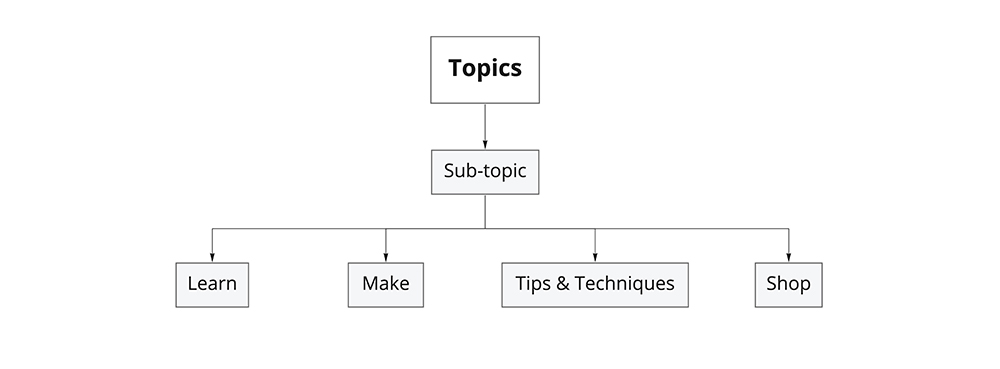
This kicked off the design phase. The Project Manager and I hunkered down in a conference room to write up detailed requirements for new navigation structures and updated page layouts. We pulled in the Site Operations team to plan out how new pages would be built and what would get updated. I partnered with a UI Designer to design new global and in-page navigation elements. And we brainstormed with the Data Science and Organic Marketing teams to develop a new construct: sub-topics, which allowed users to get to the content they wanted faster.

The project was executed through a combined effort of Site Operations and Engineering and was delivered on time for a big marketing event. In the end, the design and structure communicated what Bluprint offered in a way that matched users’ mental models, created a single experience across two tech stacks, and allowed users to move from category to category without having to learn a new structure.

What I Learned

The importance of alleviating internal churn

Throughout the project, we were working at a disadvantage. Conflicting ideas about what people were trying to accomplish left the door open to a lot of interpretation and speculation about what users needed. More frequent connections with users, along with sharing results more broadly across the company, could have helped everyone start on the same page.

The importance of verbalizing UX concepts to non-designers

It was crucial that I explained what the UX team was doing in order to keep others along for the ride. With complex and abstract subjects like information architecture, the designer knows the value of building a solid foundation, but it can be difficult to keep stakeholders from getting anxious when they’re pressed for time and needed a solution yesterday.

Now that I've had the experience, it’s become a priority of mine to build relationships with cross-functional executives so I can learn what their goals are and what’s important to them. It allows me to speak their language and bridge the gap between UX processes and business needs.